Get Empowered: Review Window and the Processing Method - Working with GPC/SEC data in Empower - Tip125
OBJECTIVE or GOAL
Work with GPC/SEC data in Empower.
ENVIRONMENT
- Empower
- Empower Tip of the Week #125
PROCEDURE
STEP 1
After the Sample Set is processed, bring the Result Set into Review. The narrow standards are first in the tree (Figure 1).

STEP 2
Click the Calibration Curve tool to view the Calibration Curve. The R2 indicates we have selected a good fit. There are 18 points on the Calibration Curve because there were three standard vials, each containing a mixture of three narrow standards, and two injections out of each vial (Figure 2).

STEP 3
Here we see the result for one of the polymers. We see the Mn, Mw, Mz, and Mz+1. The Mp is the molecular weight at the apex of the peak. The polydispersity is Mw/Mn (Figure 3).

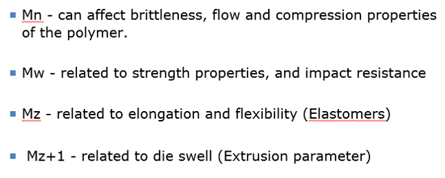
STEP 4
The various molecular weights relate to physical properties of the polymer (Figure 4).
STEP 5
Click the Results tool to go to the Results window. Select the Distribution tab to view the slice table. This table shows the molecular weight and log molecular weight for the slices across the distribution. The default shows all the slices; however, you can change that from the drop-down menu shown (Figure 5).

STEP 6
Click the Distribution Plot tab to view the molecular weight distribution. This shows us where the molecular weights mentioned in Step 3 are taken from and displays the Cumulative % plot overlaid against the distribution. The Cumulative % plot starts at ‘0’ on the far left and ends at ‘100’ on the far right (see the y axis on the right-hand side of the plot). This plot shows us the cumulative % of the polymer at a particular molecular weight as it moves from the high end of the molecular weight distribution to the low end of the molecular weight distribution. For example, at log mw of 4.92, 70% of the polymer is at or above the value of 4.92 (Figure 6).

STEP 7
To compare distribution plots for samples, highlight the results, right-click on one, and select ‘View As Molecular Weight Distributions’. Highlight the distributions for the samples, right-click, and select ‘Compare’ (Figure 7).

STEP 8
We now see the overlay of the distributions. The distribution highlighted in the table is the active one in the plot displaying the molecular weights (Figure 8).

ADDITIONAL INFORMATION
This procedure can be followed using the QuickStart or Pro interface.